 back |
 home |
 next |
 Click for original art |
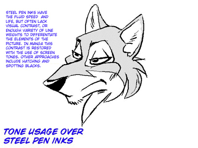
This example demonstrates steel pen inking. This type of inking doesn't really fall into strictly the painterly or draftsman approach, though it leans more towards painterly. This style was common in the US around the turn of the last century, and is still done nowadays by many manga artists. It is characterized by a speedy, fluid line. Instead of the lines being drawn to a formula or role in the drawing (like in the previous examples), they are drawn thick or thin at the artist's whim, to provide contrast and viewer interest. Occasionally one will see a slight draftsman-style approach when the artist inks character silhouettes with a heavier inking nib, but generally the line thickness is dependant purely upon the demands of the story.
The upside of this style is its speed and grace, once mastered. The downside is its dependency upon an archaic type of tool (a still-dip pen nib) that is both difficult to use, and possibly prone to disaster without some experience. It is also a style light in contrast, relying on some other form of tonal value portrayal (such as spotting of blacks or use of screen tones) to give the picture more visual punch.
 Click for original art |
Here we see a "screen tone" applied to the steel pen inks to give the picture interest, contrast, and uniform identity.
| this tutorial | ||||
back |
home |
next |
||
| Tutorials | ||||
 back |
 Home Page |
 next |
||