 back |
 home |
 next |
Until the eighties it was common to use "Letraset" or "Zip-A-Tone" to add a tonal variety. Unfortunately the desktop publishing revolution ushered in by the Apple Macintosh slowly killed the market for traditional production and commercial art supplies.
The old clear plastic sheets with adhesive backing, printed in percentages of gray of varying dot densities, have been rendered obsolete, or worse, "collectable." However, with Adobe Photoshop one can make the desktop revolution work for you. This article will show you how to use your computer to tone your artwork so it resembles dot screen style shading and toning.
Inking
You must make some adjustments to your inking style in order to make the job of toning and coloring easier. The following examples represent unsuitable inking styles for computer toning.
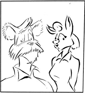
Example 1

This is a "single thickness line" ink, usually done by people with a fondness for technical pens. It's not a bad style, but the overall picture is very busy. Also, when you are "zoomed in," you can easily get confused as to what strap, pocket, or belt belongs to which character. Correcting this piece would involve a two- or three-line-weight treatment to establish character silhouettes.
Example 2
This is what is referred to as "broken line." There's nothing inherently wrong with this approach, but it is one of the least suitable styles of inking for use with computer toning. Fixing this is not really an option -- you'll spend more time closing gaps than you spent penciling and inking in the first place. This style might be suitable for a toning style resembling UPA artwork, but that's a choice to be made by the artist.
| this tutorial | ||||
back |
home |
next |
||
| Tutorials | ||||
 back |
 Home Page |
 next |
||