 back |
 home |
 next |
 Click for original
art |
From the text:
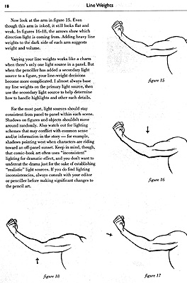
Now look at the arm in figure 15. Even though this arm is inked, it still looks flat and weak. In figures 16-18, the arrows show which direction light is coming from. Adding heavy line weights to the dark side of each arm suggests weight and volume.
Varying your line weights works like a charm when there's only one light source in a panel. But when the penciller has added a secondary light source to a figure, your line-weight decisions become more complicated. I almost always base my line weights on the primary light source, then use the secondary light source to help determine how to handle highlights and other such details.
For the most part, light sources should stay consistent from panel to panel within each scene. Shadows on figures and objects shouldn't move around randomly. Also watch out for lighting schemes that may conflict with common sense and/or information in the story -- for example, shadows pointing west when characters are riding towards an off-panel sunset. Keep in mind, though, that comic-book art often uses "inconsistent" lighting for dramatic effect, and you don't want to undercut the drama just for the sake of establishing "realistic" lighting sources. If you do find lighting inconsistencies, always consult with your editor or penciller before making significant changes to the pencil art.
| this tutorial | ||||
back |
home |
next |
||
| Tutorials | ||||
 back |
 Home Page |
 next |
||